Hybrid UX/visual – UI components, guidelines, user testing
Team:Lead designer, 2 visual designers, 1 hybrid UX/visual designer (me)
Extended teams:Marketing, content, product management
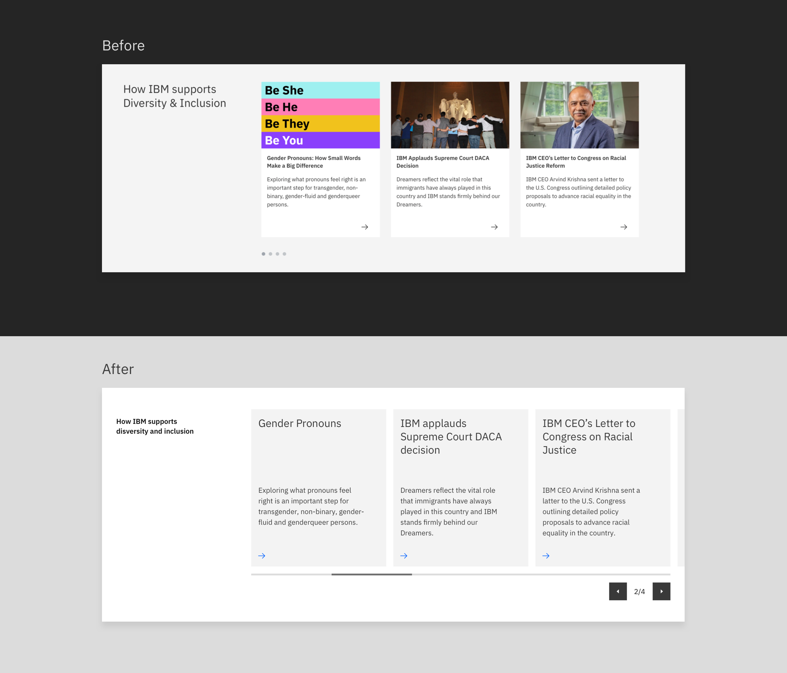
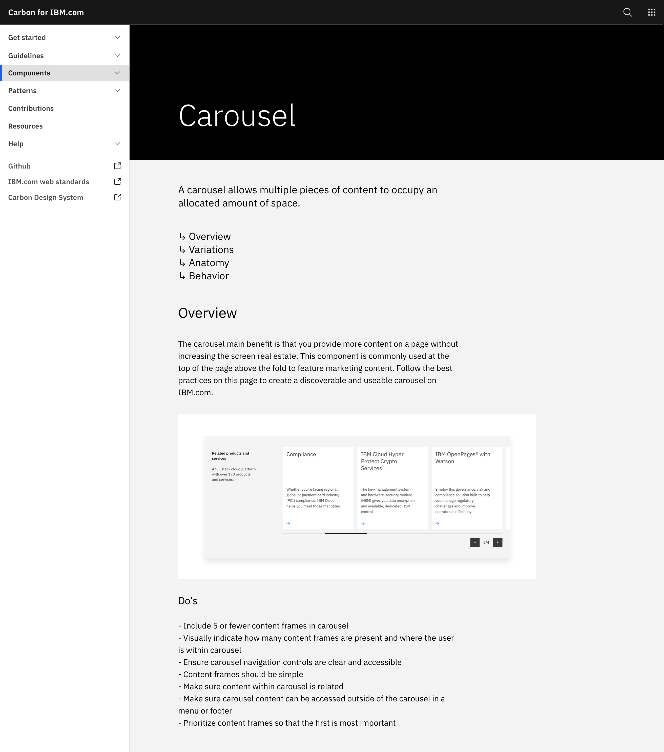
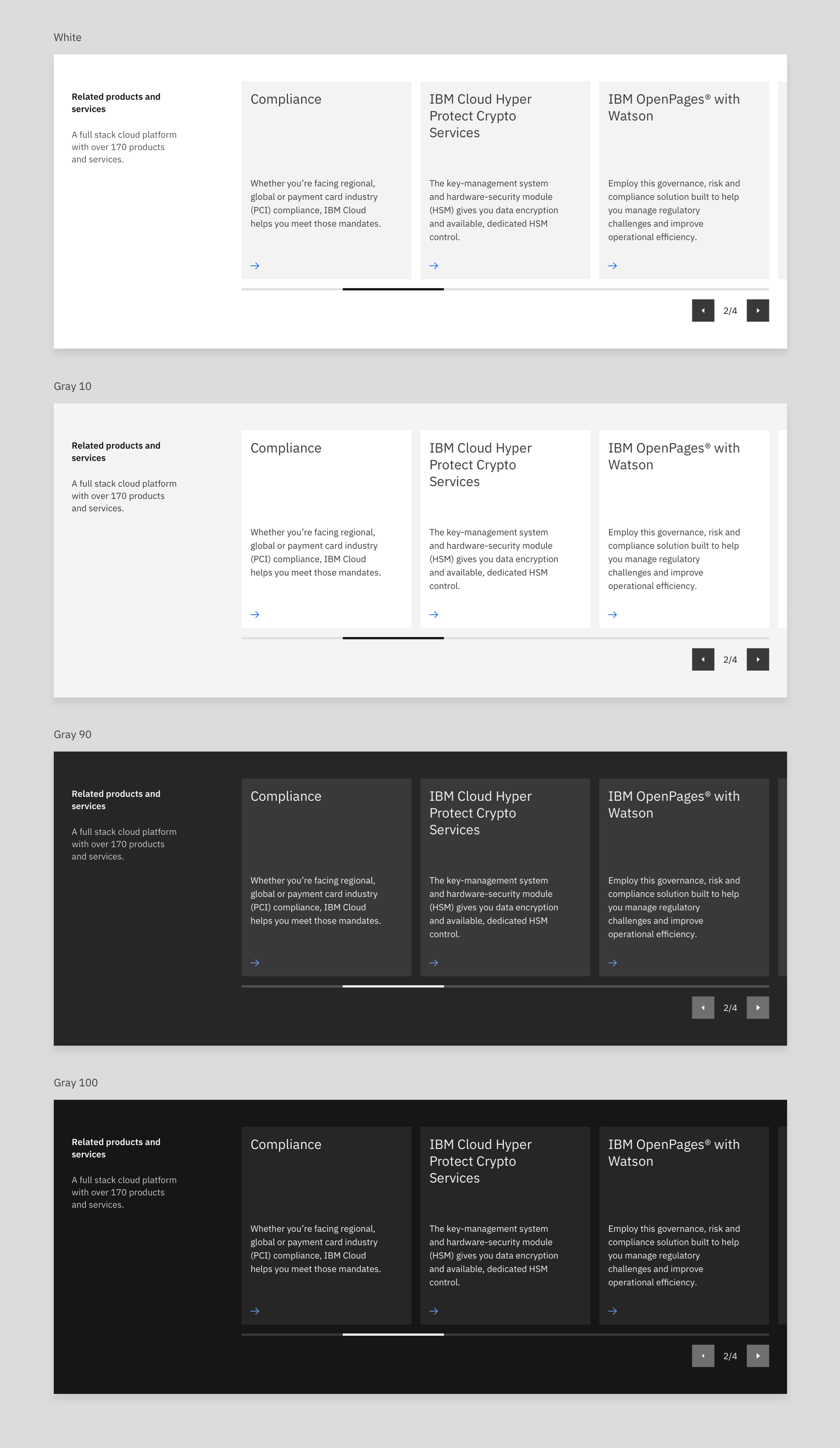
The carousel component has long held the reputation of being controversial in the UX/UI community for its lack of accessibility and hidden content. Although this component has questionable value, it does allow users to browse through multiple pieces of content within the same area of the page. I was tasked with building a useful, functional, and accessible carousel component for IBM.com.
 Guidelines
 Color themes
 In context w/ motion
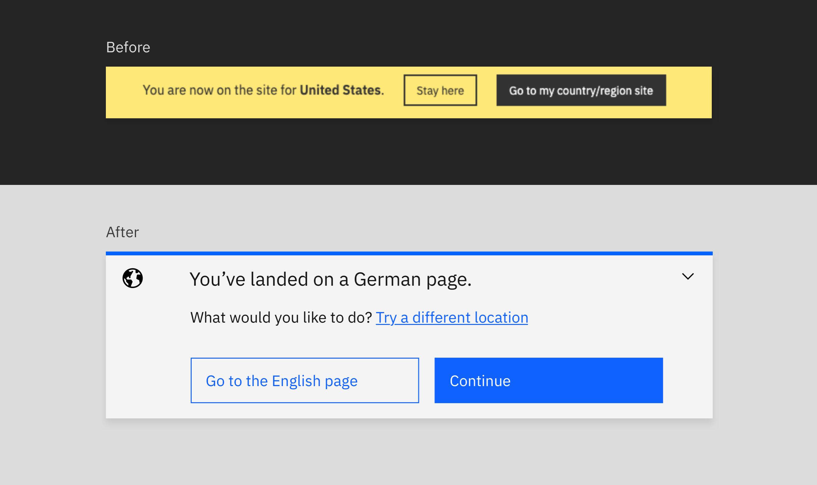
The locale change banner notifies visitors on ibm.com when they land on the page not associated with their selected location. For example, let's say my location is set to the United States but I land on a German page from a hard-coded link, the locale change banner will provide the option to continue, go to the United States page, or try a different location.
 Desktop